The Best Bedroom Colors for Sleep and How to Choose Yours
6 min read
The best bedroom colors for sleep are usually soft, muted and low in contrast: dusty blues, sage greens, warm neutrals and gentle earth tones. There is no single proven winner, and how a color feels depends on your light and taste. This guide covers common design guidance, shades to approach carefully, and how to test before you paint.
What Makes a Bedroom Color Feel Calming
Designers usually talk about three qualities. Saturation is how intense a color is. Muted, slightly grayed colors tend to feel quieter than pure, bright ones. Value is how light or dark it is. Undertone is the hidden tint, such as the green in a gray or the pink in a beige. Calming bedrooms tend to use colors that are low in saturation and soft in contrast.
Treat color psychology as general design guidance rather than proven fact. Personal associations matter a lot. A color that relaxes one person can feel cold or gloomy to another. The goal is a room that feels restful to you when you walk in at night. Look at the colors you already enjoy in clothing, art or places you have traveled. Those preferences are often a better starting point than any general rule.
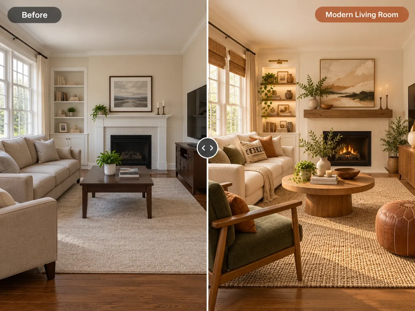
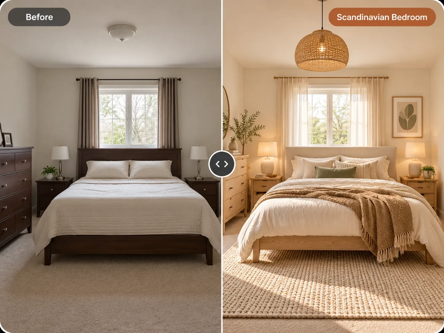
Seeing the color on your own walls is the fastest way to know. AI bedroom design lets you upload a photo of your bedroom and preview a new palette in under a minute, with the windows and layout preserved. You can try several calming bedroom colors on the same photo and compare them side by side before buying a single sample pot.
The Best Bedroom Colors for Sleep, Shade by Shade
These color families come up again and again in calm bedroom designs. Each one works best in its softer, grayer versions rather than its brightest form. Think of them as starting points, then adjust the undertone to suit your floors, furniture and the direction your windows face. Collect two or three sample shades from each family you like.
Soft blues and blue-grays
Blue is the most common choice for bedrooms, and it is often described as cool and serene. Dusty blue, slate and blue-gray feel calmer than bright sky or royal blue. In a north-facing room, choose a blue with a slightly warm or gray undertone so it does not feel icy.
Sage and muted greens
Soft greens suggest nature and pair easily with wood, linen and plants. Sage, eucalyptus and olive-gray suit Scandinavian and earthy styles alike. Greens with a gray base are especially forgiving, since they shift gently between morning and evening light. They also work well with both white and wood furniture, which makes them an easy choice if you plan to change decor over time.
Warm neutrals and earth tones
Greige, oatmeal, mushroom and soft clay tones make a bedroom feel cozy without being loud. They work well with warm lighting and natural textures. Pale terracotta or blush can add warmth if you prefer something less expected, as long as the saturation stays low. Earth tones also hide small marks and wear better than very pale colors, a practical bonus in a busy family bedroom.
Calming Bedroom Colors to Use With Care
Some colors are not wrong in a bedroom, but they need careful handling. Bright red, orange and saturated yellow are often described as energizing, which many people do not want at bedtime. Use them as small accents instead of full walls. Very high contrast, like black trim against bright white, can feel busy.
Stark white is another one to think about. Paired with cool bulbs, it can feel clinical rather than restful. A warm white or soft off-white usually feels gentler. Deep colors such as charcoal, navy or forest green can be wonderfully cocooning, especially on all four walls, but they make a small room darker and need good lamp lighting.
How Light Changes Bedroom Paint Colors
The same paint looks different in every room. North-facing bedrooms get cooler, flatter light, so warm undertones help. South-facing rooms get warmer, brighter light that can make warm colors look stronger than expected. West-facing rooms glow in the evening, which is when you use a bedroom most. East-facing rooms are bright in the morning and cooler later, so a color that looks perfect at breakfast may look flat at bedtime.
Bulbs matter as much as daylight. Warm white bulbs, often around 2700K, soften most colors and suit evening routines. Paint large samples, or use sample boards, on two different walls. Look at them in morning light and at night with your lamps on before deciding. Paint stores can usually mix small sample pots for this.
Finishes, Ceilings and Accents
A matte or eggshell finish reduces glare and feels softer than satin or gloss, which can reflect lamplight. Consider tinting the ceiling a lighter version of the wall color instead of leaving it bright white. This makes the room feel more enveloping. Color drenching, painting walls, trim and ceiling in one shade, is a popular way to create a calm, seamless bedroom.
Textiles carry color too. Bedding, curtains and rugs can echo the wall color in lighter or deeper shades for a layered look. For layouts and palettes that suit different room sizes, browse master bedroom ideas and small bedroom ideas, where lighter tones help a tight room feel more open. In a larger primary suite, a deeper wall color behind the bed can anchor the room while softer shades elsewhere keep it calm.
Preview Bedroom Paint Colors on Your Own Room
Before buying gallons of paint, test the palette on a photo of your room. In Homes Design AI, choose bedroom as the room type, pick a style, and add an instruction such as "sage green walls, warm white ceiling, linen bedding." You can change only the wall color and keep everything else, then create variations to compare blue, green and greige side by side.
Your first design is free as a watermarked preview. Keep in mind that on-screen colors are approximations, so use the AI bedroom design preview to narrow your choice to a color family, then confirm with real samples on the wall. The same testing process works in shared spaces, as covered in how to choose paint colors for a living room.
Written by the Homes Design AI team. Next step: try AI Bedroom Design on a photo of your own space.