How to Choose Paint Colors for a Living Room (Without Regret)
7 min read
Learning how to choose paint colors for a living room comes down to a few repeatable steps, not luck. You read the light, check undertones, plan the whole palette and test real samples on the wall. This guide walks through each step, with practical living room paint color ideas and a simple way to preview options before you buy a single gallon.
How to choose paint colors for a living room: start with the light
Light changes paint more than any other factor. The same swatch can look warm and buttery in one room and flat and gray in another. Before you look at a single chip, spend a day noticing how light moves through your living room. Note which windows get direct sun, when the room feels brightest, and when you actually use the space. A room you mostly enjoy at night under lamps needs a different approach than a sunny morning room.
North, south, east and west rooms
In the Northern Hemisphere, north-facing rooms get cool, indirect light that can make colors look bluer and darker. Warmer whites, soft beiges and colors with a yellow or red undertone help balance that chill. South-facing rooms get warm, strong light for much of the day, so cooler colors such as gray-blues and sage greens stay fresh instead of turning hot. East-facing rooms are bright in the morning and dimmer later. West-facing rooms glow warm in the evening.
Do not forget your light bulbs
Artificial light matters too. Bulbs labeled warm white, usually around 2700K, push colors toward yellow. Cooler bulbs around 4000K and up make the same paint look crisper and grayer. Pick your bulbs before you pick paint, or at least test samples under the lamps you will actually use at night. Many living rooms are mostly seen after dark, so evening light deserves equal weight in your decision.
Understand undertones before you pick living room paint colors
Every color has a mass tone, the main color you see first, and an undertone, the subtle hue underneath. Two grays can look identical on a tiny chip and completely different on a wall, because one leans green and the other leans purple. Undertones are why a beige can suddenly read pink or a white can look dingy next to your trim. Learning to spot them is the most useful skill for choosing wall colors.
Your fixed elements decide which undertones will work. Look at the things you are not changing: flooring, a stone fireplace, a big sofa, kitchen cabinets visible from the living room. Wood floors with orange or red tones usually sit better with warm undertones. Cool gray tile or a charcoal sofa tends to pair better with cooler undertones. To see how a candidate color sits with those elements, an AI living room design preview of your own photo can narrow the field quickly.
How to spot an undertone
Compare chips side by side rather than one at a time. Hold a candidate against a sheet of plain white printer paper, and the hidden hue becomes easier to see. Then compare it with a few similar colors from the same family. The one that looks greener, pinker or bluer than its neighbors reveals its undertone. Darker chips further down the same paint strip often show the undertone more clearly, which also helps.
Use the 60-30-10 rule to plan the whole palette
The 60-30-10 rule is a classic decorator guideline for balance. Roughly 60 percent of the room is a dominant color, usually the walls and large surfaces. About 30 percent is a secondary color, often the sofa, curtains or a large rug. The last 10 percent is an accent, carried by pillows, art, a vase or a single painted door. It is a rule of thumb, not a law, but it stops a room from feeling either bland or chaotic.
Start with what already exists. If your sofa is a deep green velvet you love, that is probably your 30 percent, and the wall color should support it. A warm off-white or soft greige would let the sofa lead. If you want the walls to be the star, keep the furniture quieter so the color has room to breathe. Thinking in proportions makes it easier to judge whether a bold color belongs on the walls or in the accents.
- 60 percent: walls and the largest surfaces
- 30 percent: sofa, curtains, a large rug or built-in shelving
- 10 percent: pillows, art, lamps, plants and small decor
- Trim and ceiling: usually a white or a lighter tint of the wall color
Living room paint color ideas by mood
It helps to decide how you want the room to feel before narrowing colors. A calm, airy room usually points toward light neutrals, pale blues or soft greens. A warm, enveloping room suggests deeper tones such as terracotta, olive or a rich mushroom brown. If you want a snug, welcoming feel, browse our cozy living room ideas for palettes built on warm neutrals and layered textures.
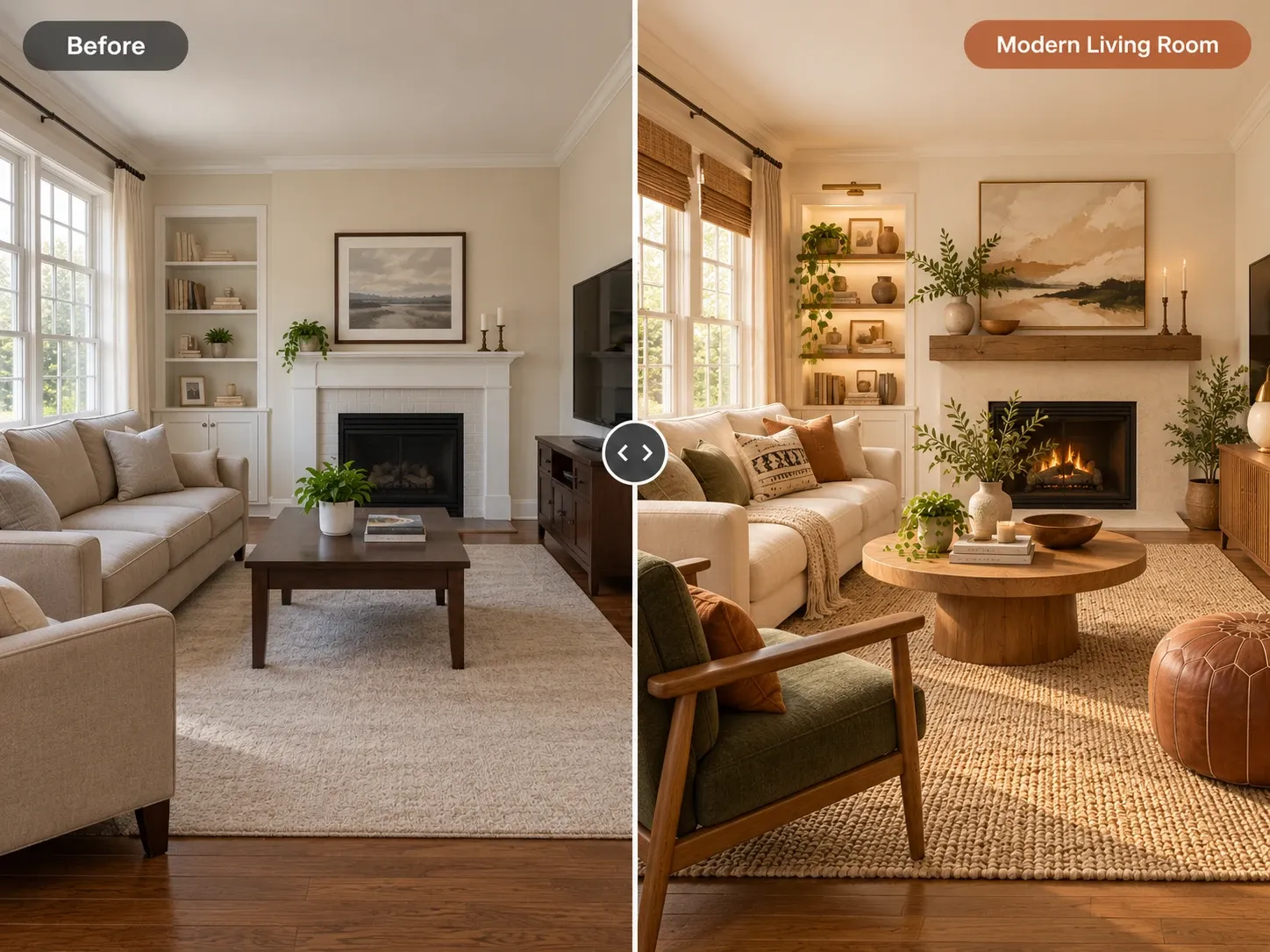
For a cleaner, more graphic look, crisp whites, soft charcoals and black accents work well together. Our modern living room ideas show how a restrained palette can still feel inviting with wood, texture and good lighting. If you are painting more than one room, keep a common thread, like the same trim white or a related undertone, so the house reads as one story.
- Warm whites and creams: bright but soft, easy with wood floors
- Greige: a flexible bridge between warm and cool furnishings
- Sage and olive greens: calm, natural, good with plants and wood
- Muted blues: restful, especially in sunny, south-facing rooms
- Deep tones like navy or terracotta: dramatic, best with good lighting
Test paint samples the right way
Never choose from a chip alone. Buy sample pots or large peel-and-stick samples of your top two or three colors. Make each swatch roughly two feet square, and put them on different walls, including one near a window and one in the darkest corner. Leave a strip of your current wall or a white board between them, so neighboring samples do not influence each other.
Look at the samples for at least two or three days, in morning light, afternoon light and under lamps at night. Notice which one you keep liking at every hour, not just the one that wins at noon. Check them next to your sofa fabric, floor and trim. Color often looks more intense on four walls than on a small patch, so many people go one step lighter than their favorite sample.
Preview the whole room before you paint
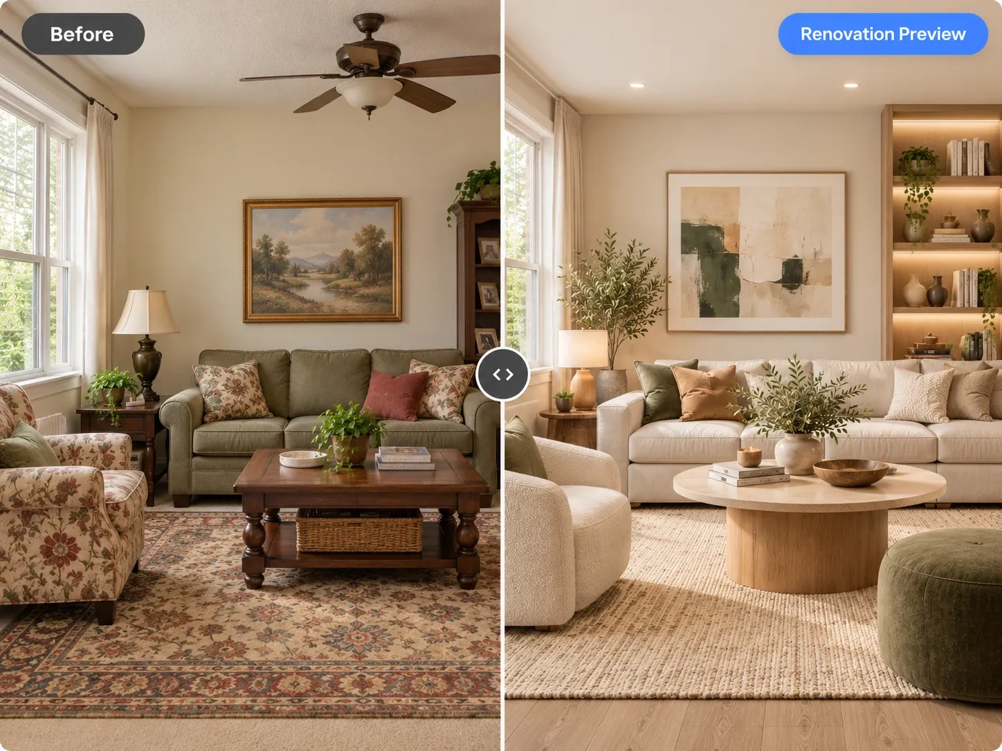
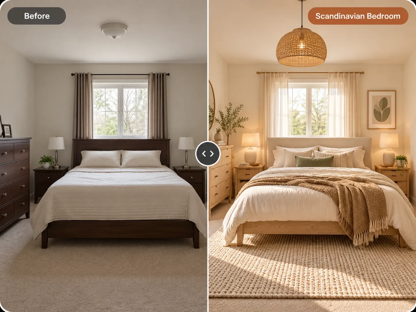
Sampling tells you how paint behaves, but it is hard to imagine a whole room from a few squares. A quick visual preview fills that gap. With AI living room design in Homes Design AI, you upload a photo of your actual living room and type a plain request, such as soft sage walls, keep the furniture. You can change only the walls, leave flooring and furniture alone, and create a few variations to compare. Results arrive in under a minute.
Treat these images as a shortlist tool, not a final match. Screens, cameras and AI rendering all shift color, so an on-screen wall color is an approximation of the real paint. Use the preview to rule out directions that feel wrong, then test real samples of the survivors on your walls. Your first design is free. Once the walls are settled, our guide on how to arrange furniture in a living room covers the next step.
Written by the Homes Design AI team. Next step: try AI Living Room Design on a photo of your own space.